What is Mobile Responsive Checker ?
As more and more people access the internet from mobile devices, it’s important to make sure your website is mobile responsive. A mobile responsive tester can help you test your website to see how it appears on different devices.
There are a few different ways to test your website’s responsiveness. You can use a mobile responsive testing tool like Google’s Mobile-Friendly Test or you can test your website on different devices yourself.
If you’re testing your website on different devices yourself, you’ll want to make sure you test on a variety of different devices, including phones, tablets, and laptops. You’ll also want to test different browsers and screen sizes. Testing your website on as many different devices and browsers as possible will help you ensure that your website is mobile responsive for everyone.
What Does Mobile Responsive Tester Checks ?
A mobile responsive tester is a tool that helps developers ensure that their website or web application is correctly displayed on mobile devices. It allows developers to test how their site or app will look on different screen sizes and devices, and make changes accordingly. A mobile responsive tester is an essential tool for any developer who wants to create a site or app that is accessible to as many people as possible.
How to Use Mobile Responsive Website Tester ?
To use a mobile responsive tester, simply enter the URL of your website into the tester and select the device you want to test it on. The tester will then show you how your website looks and functions on that device. You can use this information to make changes to your website so that it looks and works its best on all devices.
What Are the Best Tools to Perform Website Responsive Check?
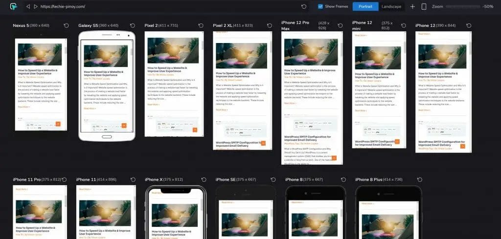
Hoverify All-in-one browser extension for web development
Hoverify is my preferred mobile responsiveness checker as I can emulate all possible screen sizes from mobile, tablet, laptop, desktop and widescreen breakpoints.
You can add all these breakpoints inside its responsiveness checker tool all at once, be it portrait and landscape view. Right now the tool costs $30/year for 3 active installations, meaning you can install this tool up to 3 different browsers as it is compatible with most web browsers.
For more details about the tool, you can check my unbiased Hoverify Review.
The website mobile responsiveness checkers mentioned below are free alternatives.
ResponsiveDesignChecker.com
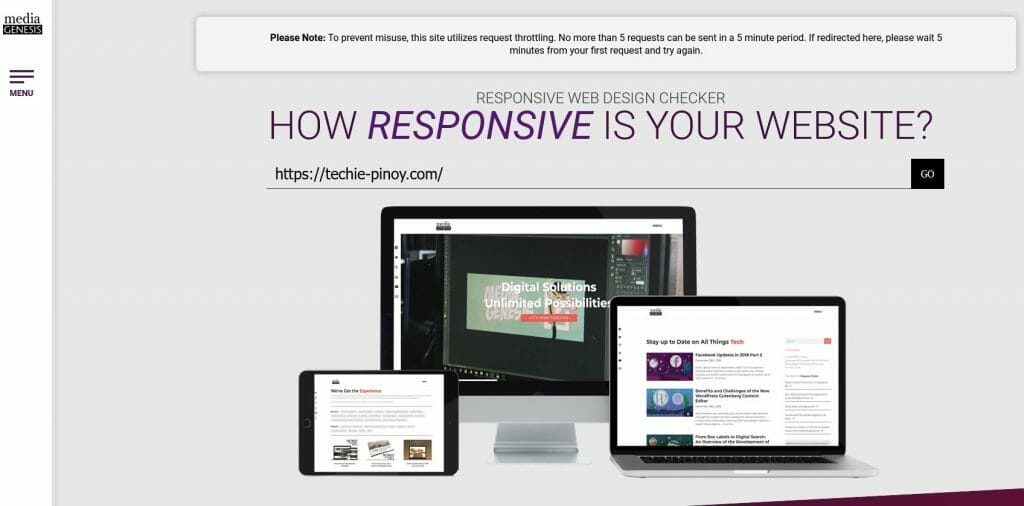
If you’re looking for a quick and easy way to check if your website is responsive, you’ll want to check out responsivedesignchecker.com. This online tool is a free mobile responsiveness tester that lets you enter a URL and see how it looks on different screen sizes. It’s a great way to test your site’s responsiveness and make sure it’s looking its best on all devices.
ResponsiveTestTool.com
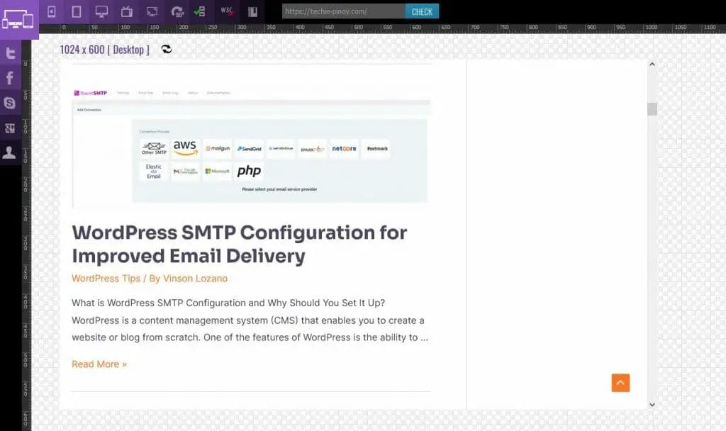

If you’re looking for a quick and easy way to test how your website will look on different mobile devices, then you’ll want to check out responsivetesttool.com. This online tool lets you enter a URL and then see how it renders on a variety of different screen sizes.
You can also adjust the viewport size and orientation to see how your site will look in different scenarios. This is a great way to get a feel for how your site will respond to different screen sizes and devices. Plus, it’s free to use!
Responsive Tester Chrome Extension
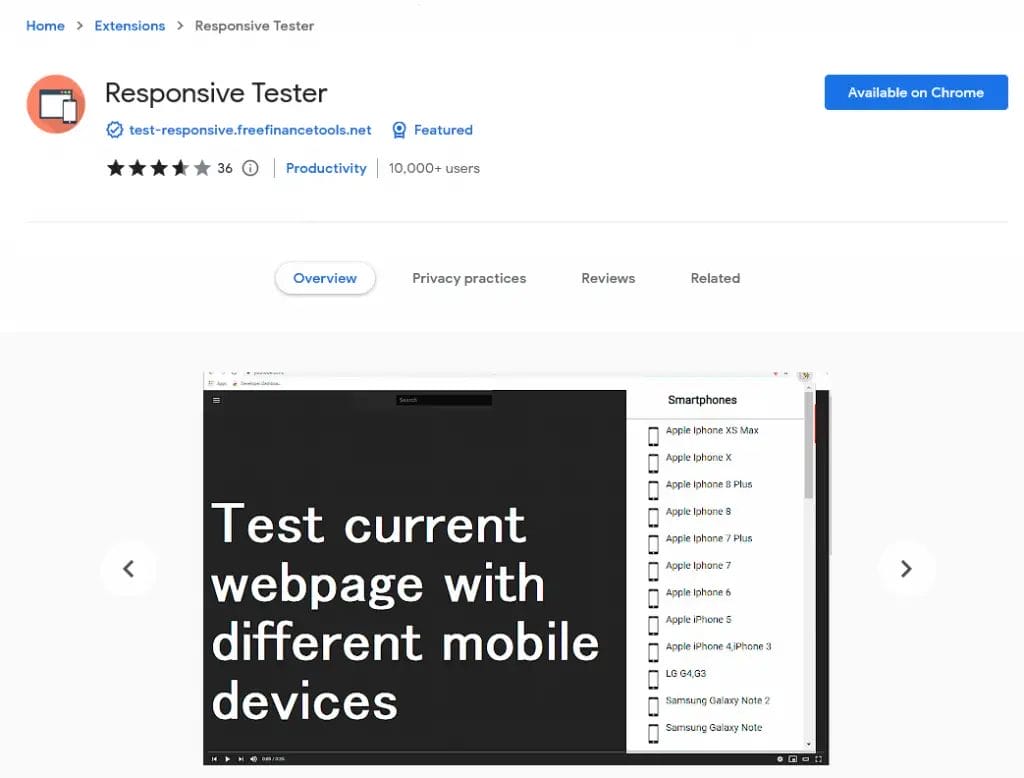
The Responsive Tester chrome extension allows web developers to test their web pages designs from different screen sizes including mobile, phablet and tablet devices by emulating the user agent and screen resolution, and can switch easily between portrait and landscape mode.
Website Planet
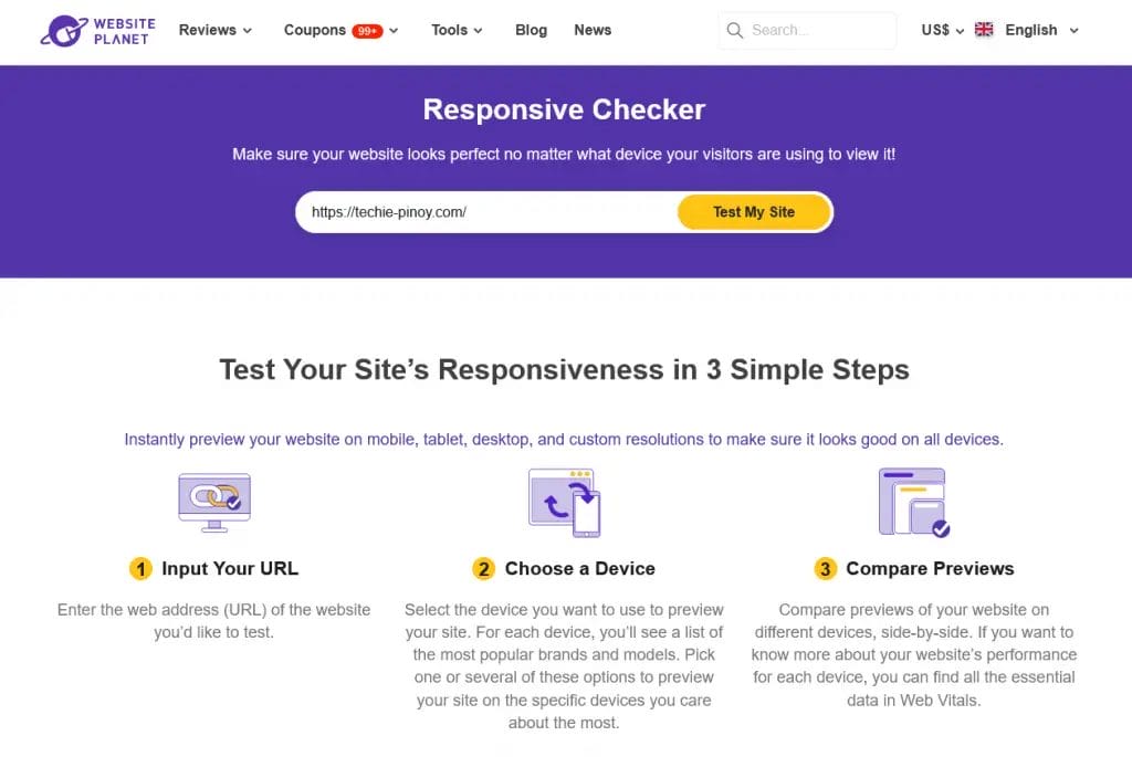
The Website Planet online mobile responsive checker is a free mobile responsive test tool for checking whether your website is responsive or not. Simply enter your website URL into the checker, and it will analyze your website to see if it is mobile responsive.
Conclusion
Since multiple screens are being used to access the internet, it is essential to design your site in such a way that it is mobile responsive. Mobile responsive tester is a tool that can help you with your web designing.